
Trusted by Top Brands





Responsive Web Design Projects We’ve Developed
Our responsive work spans early MVP builds to enterprise platforms serving users across dozens of cities and countries. The three projects below show where responsive design changed the outcome, not just the appearance.
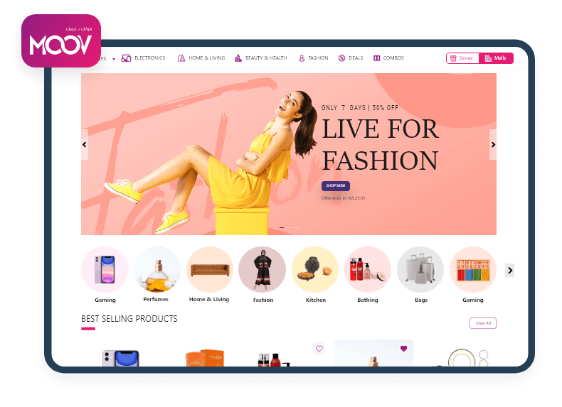
Moovstore
Web Solution | PHP | Laravel | MySQL
A custom eCommerce platform built for a Saudi retailer to sell smoothly across mobile and desktop.
- Mobile-first storefront optimized for high-traffic shopping
- Responsive product pages with a streamlined mobile checkout
- 15% increase in conversion rate
- Secure payment integration and inventory management
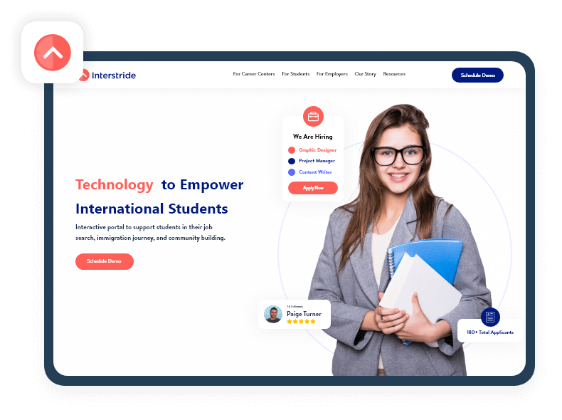
Interstride
Web Solution | Ruby on Rails | PostgreSQL
A career platform helping international students navigate jobs, visas, and opportunities from any device.
- Responsive dashboards for students and university partners
- Adaptive layouts for complex data tables and search filters
- Touch-friendly navigation across phones, tablets, and laptops
- Built to scale across multiple institutions
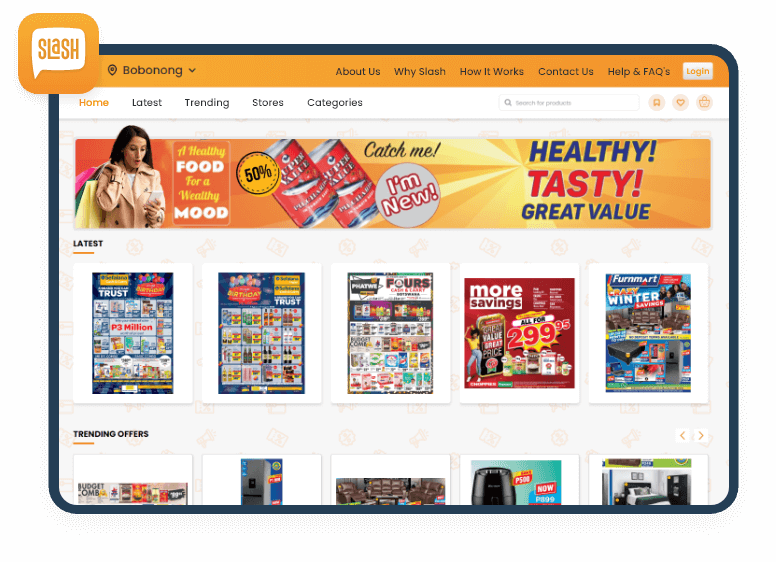
Slash Deals
Web Solution | AngularJS | GoLang | MySQL
A deals portal connecting users across 103 cities with location-based offers and listings.
- Responsive marketplace tuned for fast mobile browsing
- Touch-friendly navigation and filtering
- High-performance pages under heavy traffic
- Location-based offers across 103 cities
Stop Losing Mobile Buyers To Slow, Broken Page Layouts Today
More than half of web traffic comes from phones. Our responsive web design services give every visitor a fast, clear experience that turns mobile browsing into real revenue.
What Our Clients Say About Us

Project Summary
Website Dev for Public Affairs & Government Relations Firm
We have built a website for a public affairs and government relations firm. The team has been tasked with designing the interface, integrating application forms, and building a backend system.
Project Summary
Web Development for Education Company
We have developed an online education company’s website. They’ve incorporated live video streaming, interactive quizzes, and forums into the site.
Project Summary
Web Sales App for Roofing & Wall Contractor
We have built a web sales and production platform to increase productivity and efficiency. The web-based solution manages estimates, proposals, and orders.
Project Summary
Logo Design & Web Dev for Car Inspection Service Company
We developed and designed the website for a car inspection firm based in France, including all backend and frontend work. The website is automated to receive and handle customer inquiries.
Project Summary
Web & App Development for Telemedicine Company
We provided web and app development services for a medical telecoms company. Their team handled product and UI designs as well as integrated a telemedicine platform to build the app and site.
Responsive Web Design Services We Offer
As a responsive web design company, Monocubed handles responsive website design services end to end, so you are not stitching together a separate designer, developer, and QA freelancer who never talk to each other. One team owns design, engineering, testing, and AI integration.
Your site should fit every screen. No pinching, no sideways scrolling. We design and build it with fluid grids, flexible images, and carefully tested breakpoints, owning both the visual design and the production code so nothing slips between separate teams.
Mobile-First and Adaptive Layouts
Most of your visitors arrive on a phone. That experience cannot be an afterthought. Our mobile web design services start at the smallest screen, keep core content fast and usable there, then scale the layout up to tablets and desktops.
Responsive eCommerce Design
Losing shoppers at the mobile checkout? It is rarely the price. We build responsive storefronts with fast, tappable product pages and a checkout that survives peak traffic, so more of your phone visitors actually finish buying instead of bouncing away.
Responsive Web App and PWA Builds
Want app-like speed without the app store? We develop responsive web apps and progressive web apps with real offline support through our progressive web app development services. They feel native on a phone, yet run anywhere a modern browser does.
Good responsive design disappears. Users just find what they need. Our responsive web design services shape wireframes, prototypes, and interfaces for readability at every breakpoint, keeping navigation, forms, and content tappable whether someone is on a phone or a monitor.
Stuck with a fixed-width site that breaks on phones? We rebuild it as a fully responsive experience without losing your content or rankings. The migration is handled carefully, and you end up with a faster, mobile-ready site that ranks better.
Cross-Device and Cross-Browser QA
It looks perfect on your laptop. Then someone opens it on an Android phone. We test every build on real devices and browsers, checking Chrome, Safari, Firefox, and Edge across iOS and Android, at every screen size, before a single visitor ever sees it.
Performance and Core Web Vitals Optimization
Speed is a ranking factor now, not a nice-to-have. As a responsive web development company, we tune images, code, and loading behavior toward strong Core Web Vitals scores, because Google judges your mobile performance first, and so do impatient users.
AI Integration for Responsive Websites
Modern websites can do more than resize. We build AI features like chatbots, personalized content, and recommendation engines straight into responsive interfaces, so the site adapts to each visitor, not only each screen, and engagement climbs through relevant, on-brand interactions.
Why Choose Monocubed for Responsive Web Design
Plenty of responsive web design companies can make a homepage look good in a desktop mockup. As a responsive web design service provider, we pair senior responsive web designers with engineers who ship code that performs on real devices, not just in demos:

Deep responsive design expertise

Signs NDA

Dedicated responsive web developers

100% data security

Constant feedback cycle

Regular updates

Complete transparency

Cross-device quality assurance

Up to 90-days maintenance support
Outperform Competitors With Responsive Websites That Adapt And Convert Everywhere
Our 50+ developers build mobile-first websites with AI-driven features like chatbots and product recommendations, helping you turn more visitors on every device into paying customers.
Technologies We Use for Responsive Web Design
We pick the stack to fit your project, not the other way around. The tools below are what our responsive web design service reaches for most often when a build needs fast load times, clean adaptive layouts, and AI features that actually ship.
Languages
 HTML5
HTML5- CSS3
- JavaScript
- TypeScript
- PHP
- Python
 HTML5
HTML5 CSS3
CSS3 JavaScript
 TypeScript
 PHP
PHP Python
Frontend Frameworks
- React.js
- Angular
- Vue.js
- Next.js
 React.js
 Angular
 Vue.js
 Next.js
CSS and Styling
- Tailwind CSS
- Bootstrap
- CSS Grid
- Flexbox
 Tailwind CSS
 Bootstrap
 CSS Grid
 Flexbox
Backend
- Node.js
- Laravel
- Django
- Ruby on Rails
 Node.js
 Laravel
 Django
 Ruby on Rails
CMS
- WordPress
- Drupal
- Magento
 WordPress
 Drupal
 Magento
AI Technologies
- OpenAI
- Claude
- TensorFlow
- PyTorch
- Scikit-learn
- Gemini
- Llama (Meta)
- IBM Watson
- Mistral AI
- OpenCV
 OpenAI
 Claude
 TensorFlow
 PyTorch
 Scikit-learn
 Gemini
 Llama (Meta)
 IBM Watson
 Mistral AI
 OpenCV
Cloud and DevOps
- AWS
- Google Cloud
- Microsoft Azure
- Docker
 AWS
AWS Google Cloud
 Microsoft Azure
 Docker
Testing and Performance
- BrowserStack
- Lighthouse
- Cypress
- Jest
 BrowserStack
 Lighthouse
 Cypress
 Jest
JestAPI
- REST APIs
- GraphQL
 REST APIs
 GraphQL
Our Responsive Web Design Process
No two responsive builds are identical, but the way we run them is. Across 200+ projects, our responsive web design agency has settled on a six-step process that removes guesswork, keeps you in the loop, and catches problems before launch, not after.
Discovery and Strategy Planning
Before any design work, we map your business goals, audience, and the devices your visitors actually use most. We gather requirements, review your current site, and define the responsive strategy and technology stack that fit your scope, timeline, and budget.
Design and User Experience
Design comes next. We build wireframes and high-fidelity mockups for mobile, tablet, and desktop breakpoints, then test usability early so navigation, content hierarchy, and interactions stay clear and consistent across every screen size before a single line of production code.
Development and Programming
Now the build begins. Using modern frameworks, fluid grids, flexible images, and clean, maintainable code, we apply responsive best practices and integrate APIs and any AI-driven features through agile sprints, with continuous integration keeping everything stable at every single step.
Testing and Cross-Device QA
Quality assurance is where responsive sites prove themselves. We test functionality, performance, and layout across real physical devices, browsers, and resolutions, running security checks, load tests, and accessibility reviews so the site performs reliably for every real user before production.
Deployment and Launch
With everything tested, we set up the production environment, migrate to live servers, and deploy with zero downtime. We monitor closely during launch and confirm every page works correctly across devices and browsers before handing the finished site to you.
Support and Maintenance
Launch is the beginning, not the end. We provide 90 days of complimentary maintenance, then ongoing support whenever you need it, monitoring performance, shipping updates, fixing issues, and planning for scalability so your responsive site keeps performing as you grow.
Get A Responsive Audit That Shows Where Visitors Drop Off
Our senior frontend engineers review your site and pinpoint exactly where slow load times, broken layouts, or touch issues are quietly costing you conversions on mobile.
Industries We Serve
We build responsive solutions for sectors with very different users and requirements, from regulated industries to high-traffic marketplaces and content-heavy platforms. Each build is tuned to how that audience actually browses.
eCommerce and Retail

Most shopping carts are now opened on a phone, so checkout friction costs real revenue. Our responsive storefronts keep product pages fast and tappable through peak traffic, with AI recommendation engines that nudge average order value higher across every device.
FinTech and Banking

People check balances on phones and approve transfers from laptops, often minutes apart. We design secure, responsive dashboards with clear data visualization and accessible forms, meeting strict compliance expectations while keeping every interaction fast and trustworthy on the smallest screens.
Healthcare

A patient booking an appointment at midnight needs the same clarity a nurse gets at a workstation. Our responsive patient portals, telehealth platforms, and scheduling systems stay accessible and secure on any device, reducing everyday friction for less tech-confident patients.
Education and eLearning

Students switch between a laptop in class and a phone on the bus, expecting their courses to follow. Our responsive learning platforms keep dashboards, lessons, and assessments organized across institutions, so complex material stays readable and easy to navigate everywhere.
Real Estate

Buyers shortlist homes from their phones long before they ever call an agent. We build responsive property platforms with map search, virtual tours, and listing management, serving fast, image-rich pages that stay smooth, where most browsing and shortlisting now happens.
Travel and Hospitality

Travelers book on the move, often mid-commute or waiting at a gate. Our responsive booking engines, reservation systems, and guest platforms keep search, booking, and payment fast and intuitive on any device, cutting the drop-off that loses reservations on phones.
Logistics and Transportation

Dispatchers work at desks while drivers check the same data on phones in the cab. We build responsive tracking dashboards, fleet tools, and supply-chain platforms that stay clearly readable on small screens, even in rugged conditions and patchy network coverage.
SaaS and Technology

Dense dashboards that work on a 27-inch monitor often fall apart on a phone. We develop responsive web apps where data density meets real usability across breakpoints, supported by our frontend web development services and senior engineers behind every build.
Media and Entertainment

Readers and viewers scroll on phones during short breaks, and a slow gallery loses them instantly. We create responsive content platforms with fast-loading media, smooth navigation, and engaging layouts, tuned so heavy images and video stay quick on any screen.
 All our projects are secured by NDA